Cookery
تطبيقات
علامات تجارية
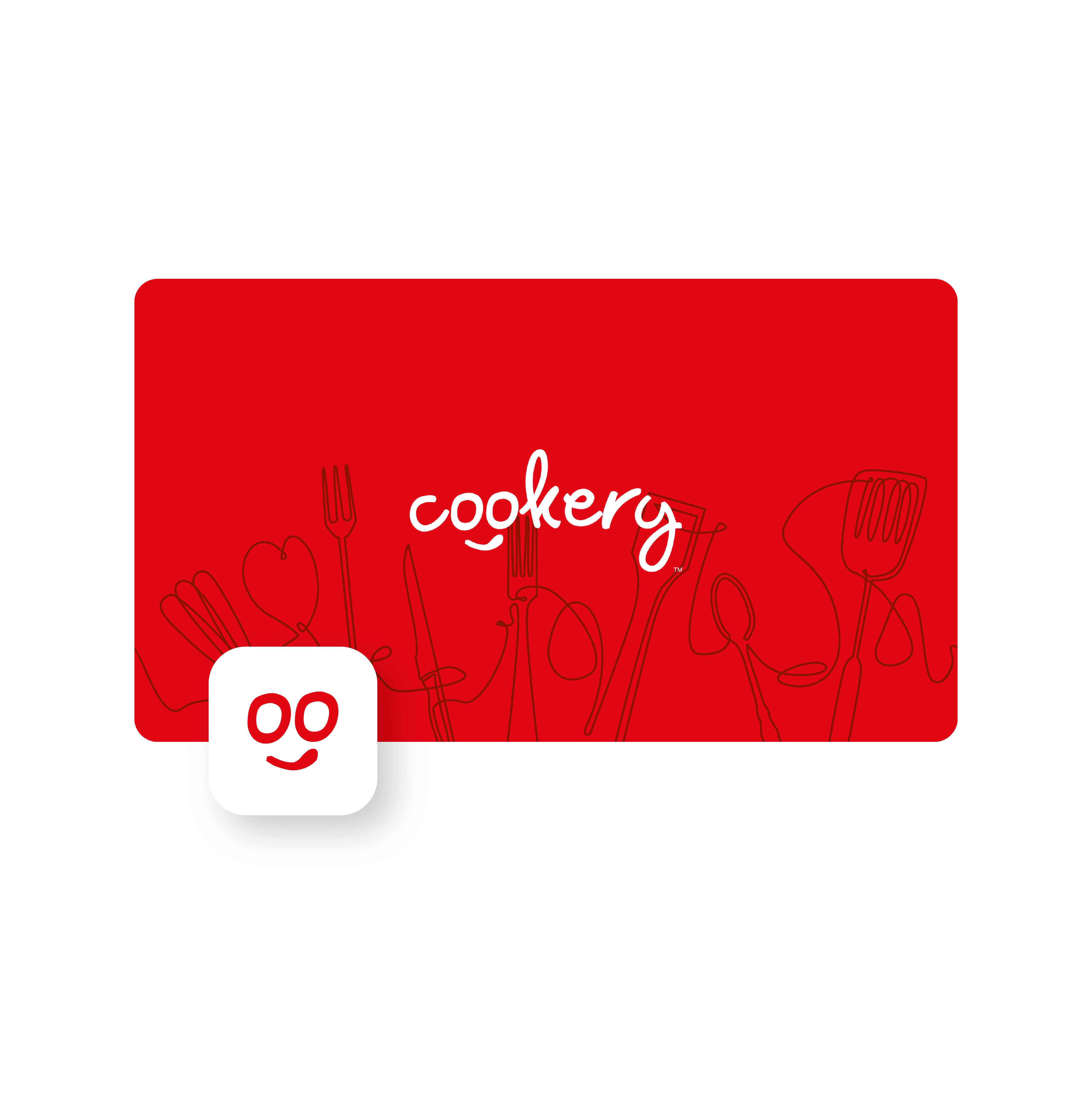

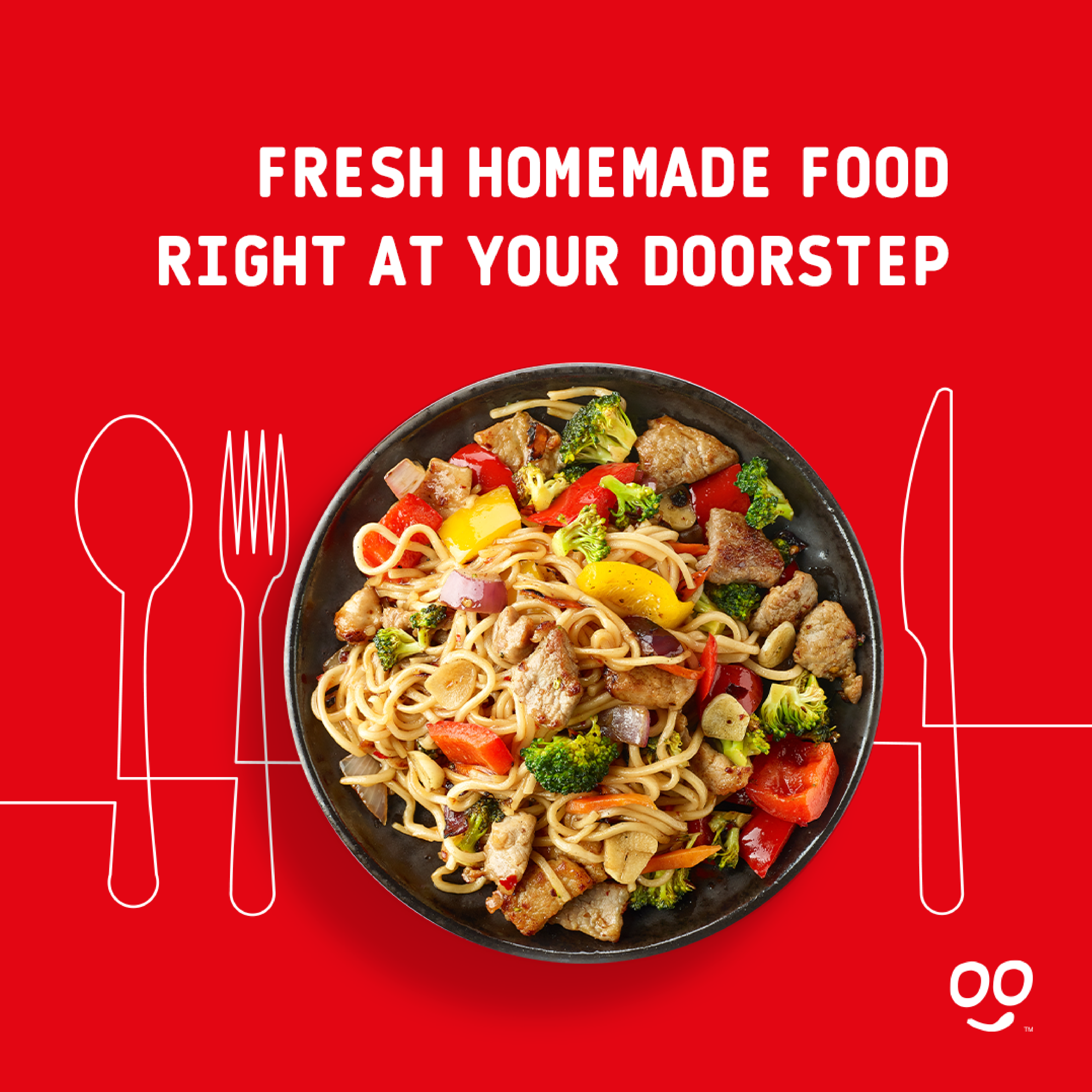
Are you tired of sifting through endless cookbooks and recipe websites, trying to find the perfect dish to cook?
Look no further, because Cookery is here to help.
Our goal was to create a fun, professional, and friendly platform that provides users with a unique culinary experience.
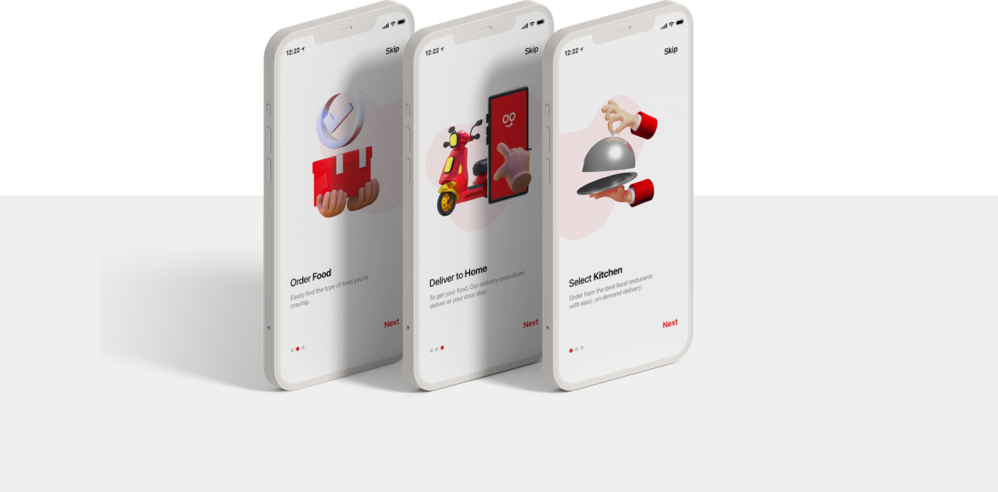
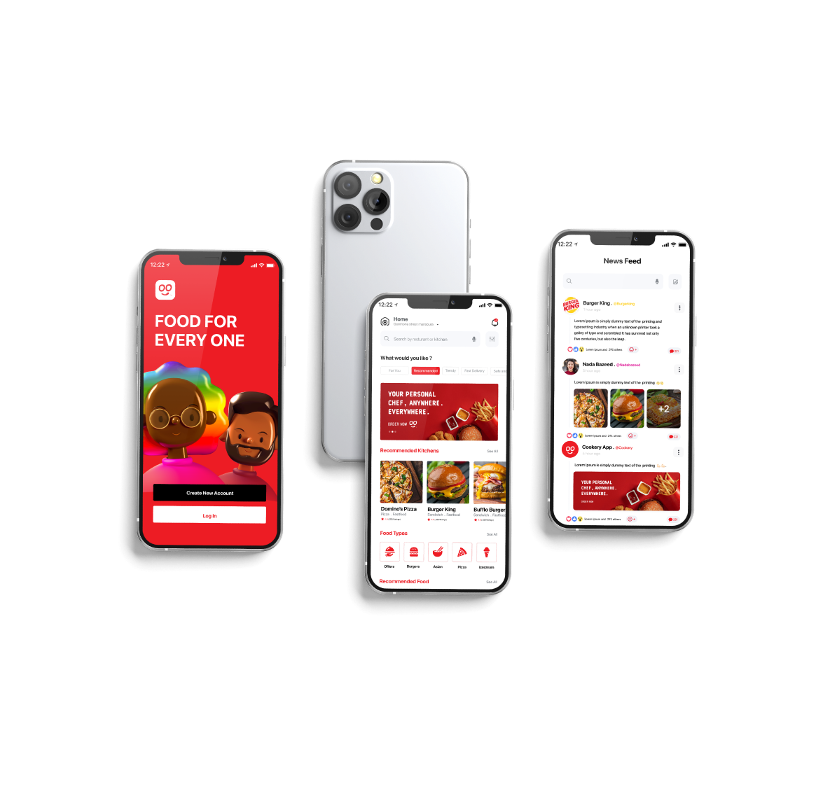
Initially, our goal was to create a fun, professional, and friendly distinctive visual identity that denotes brand characteristics.
We used the brand name to get to that, with some properties added to it to get a nice and balanced shape.
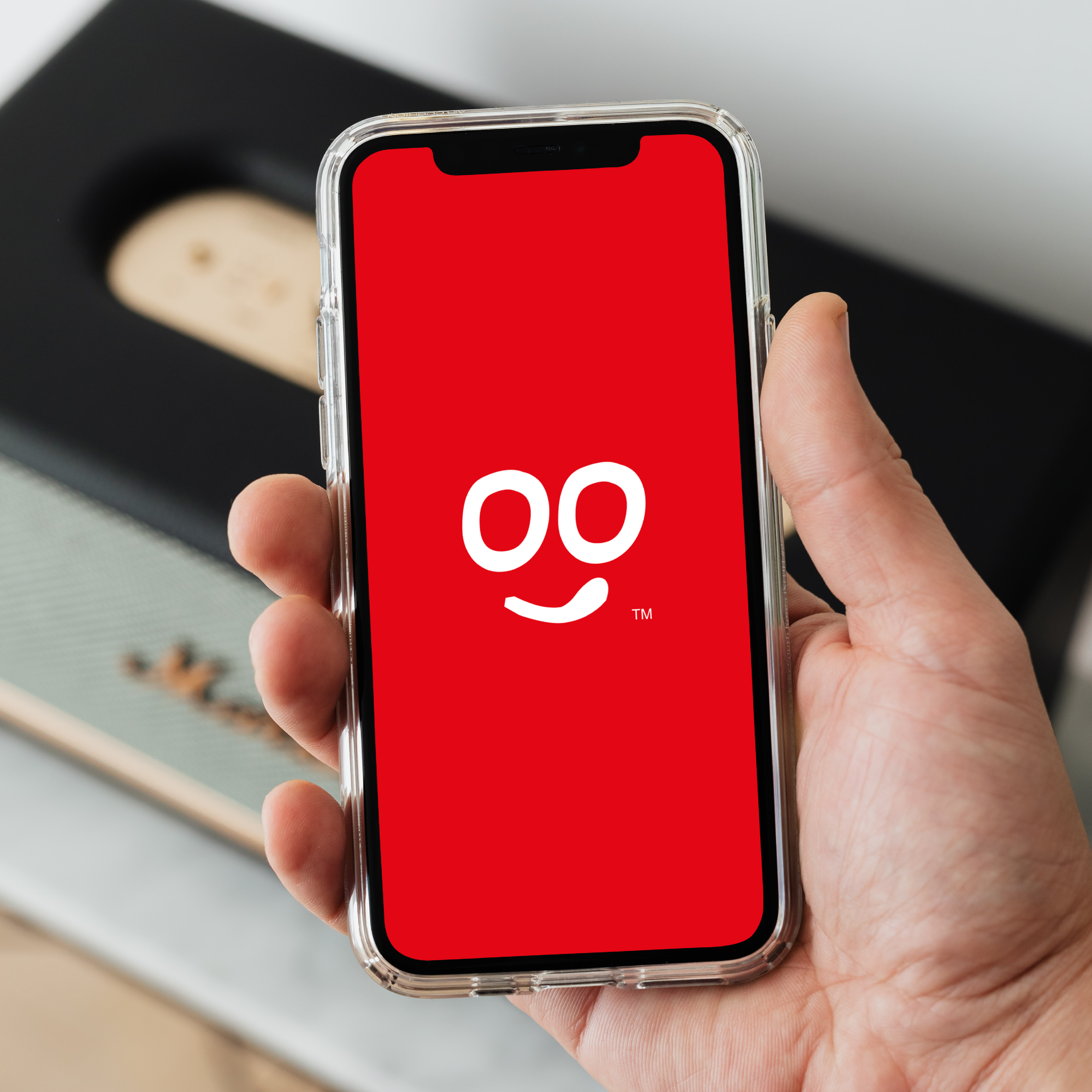
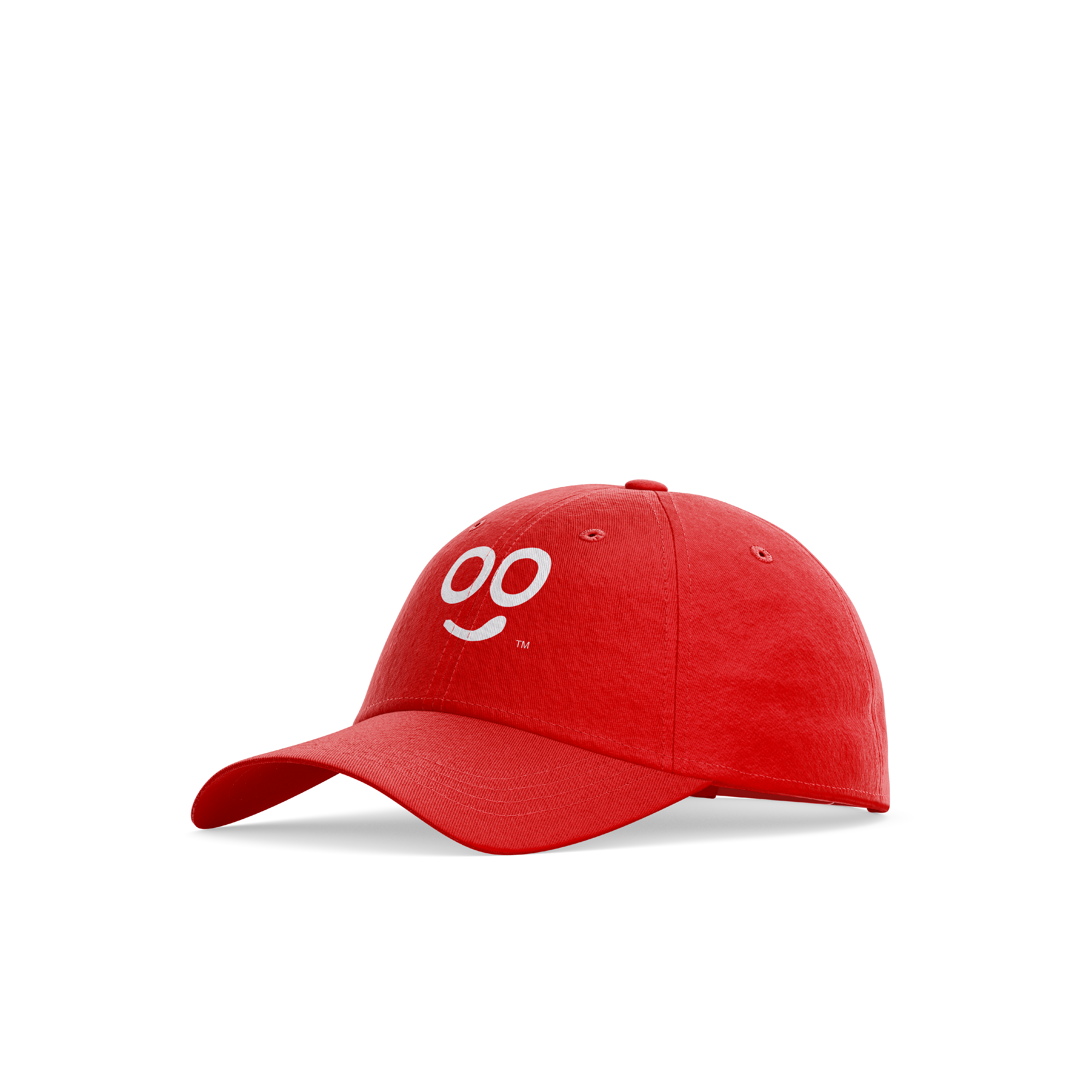
A smile is added to the double O letters in the middle, representing a smiling face that licks its face to express the greatness of the taste,
while maintaining a simple icon that fits the phone
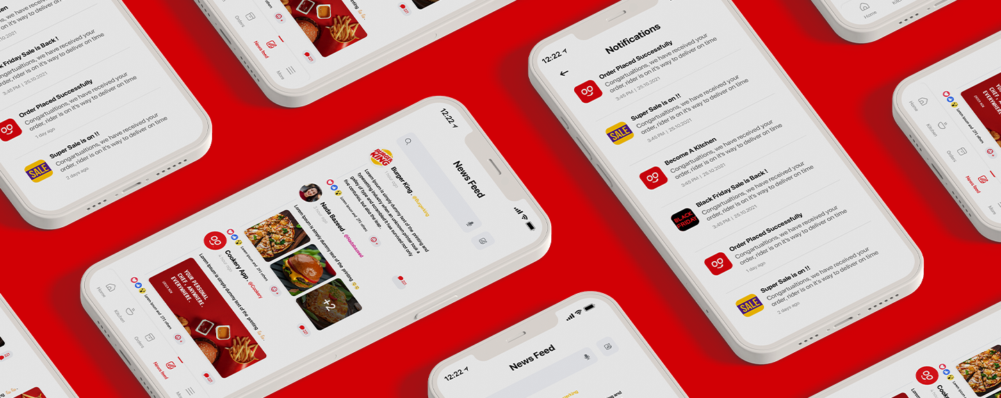
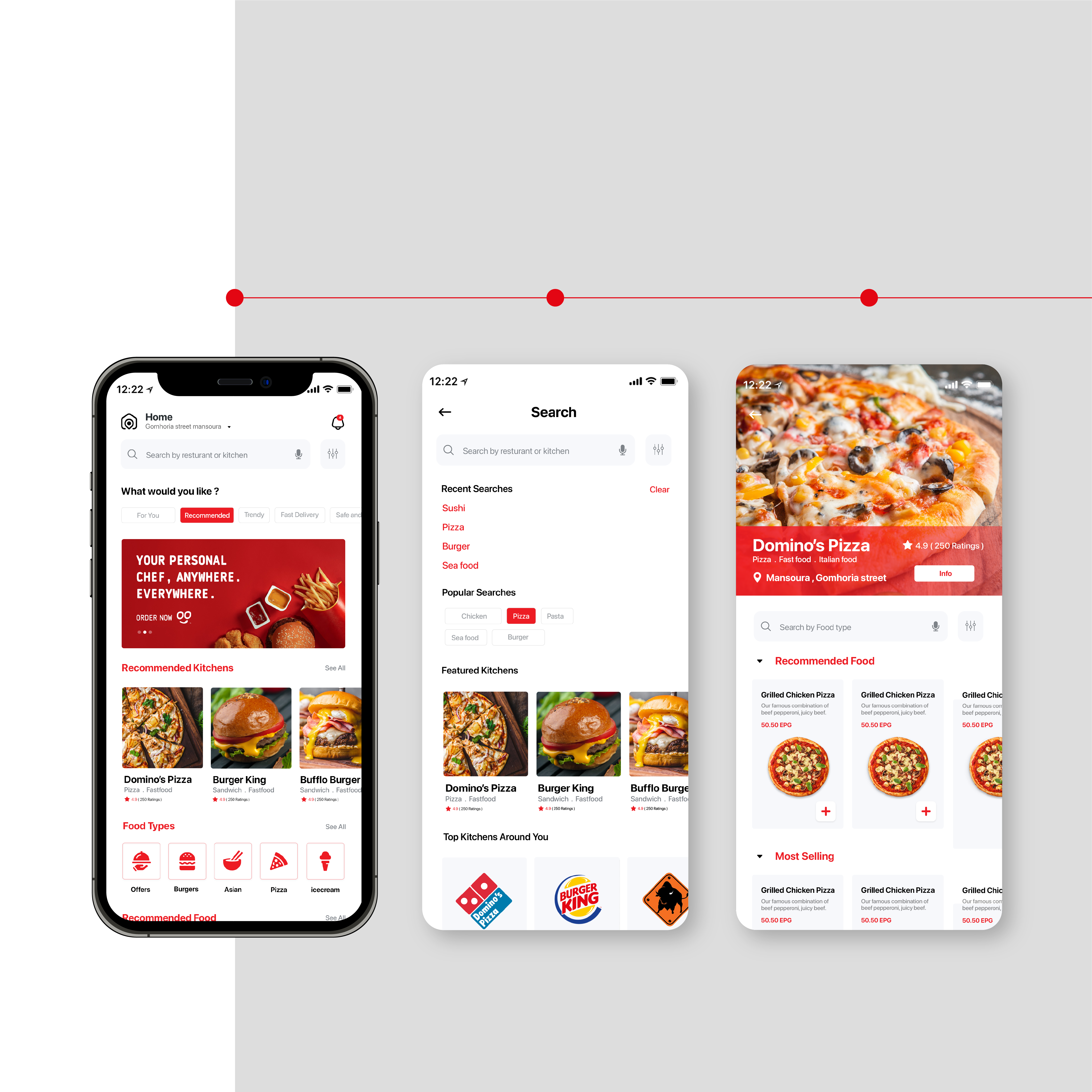
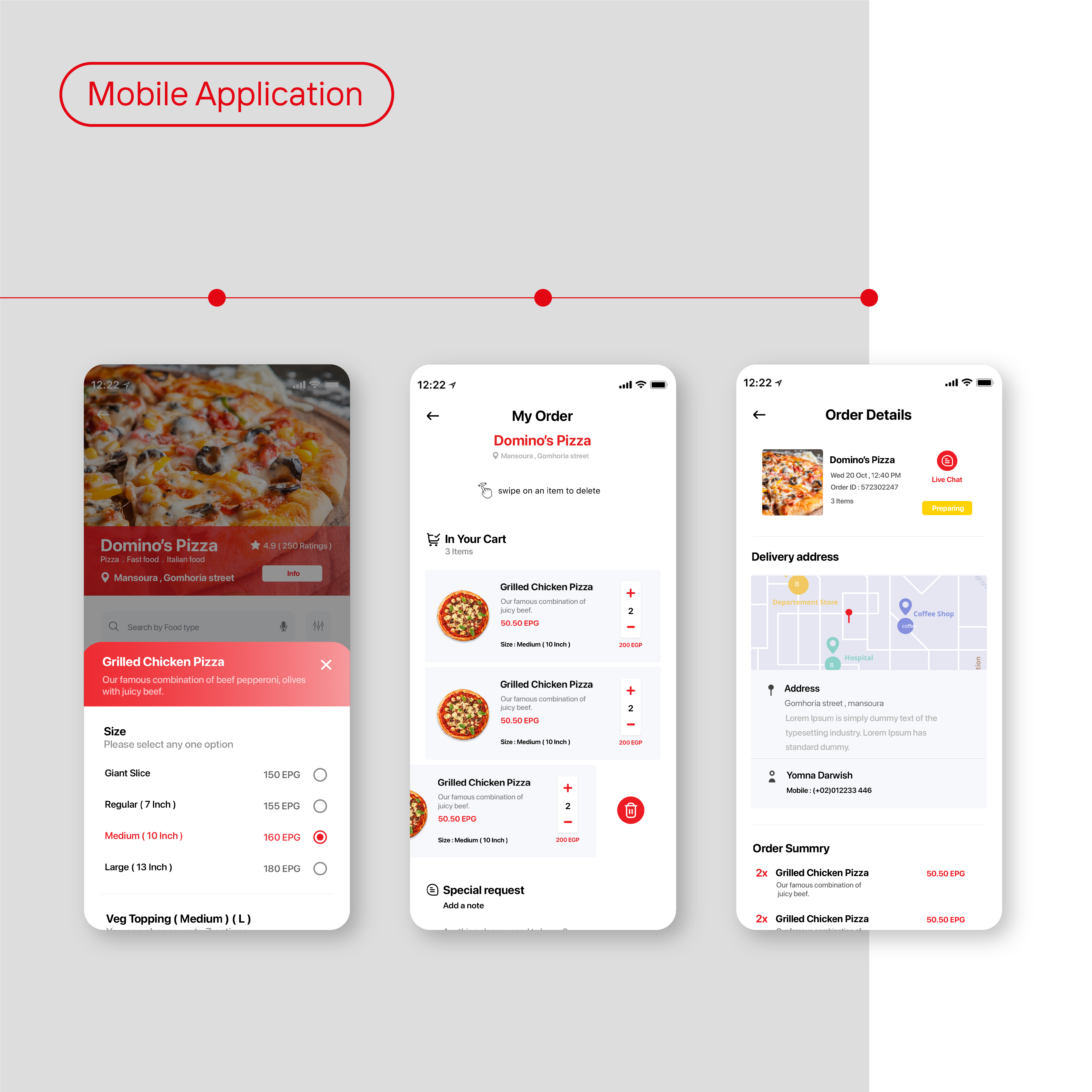
At Cookery, we believe that cooking should be enjoyable, which is why we went above and beyond to create a distinctive visual identity that accurately represents our brand values.
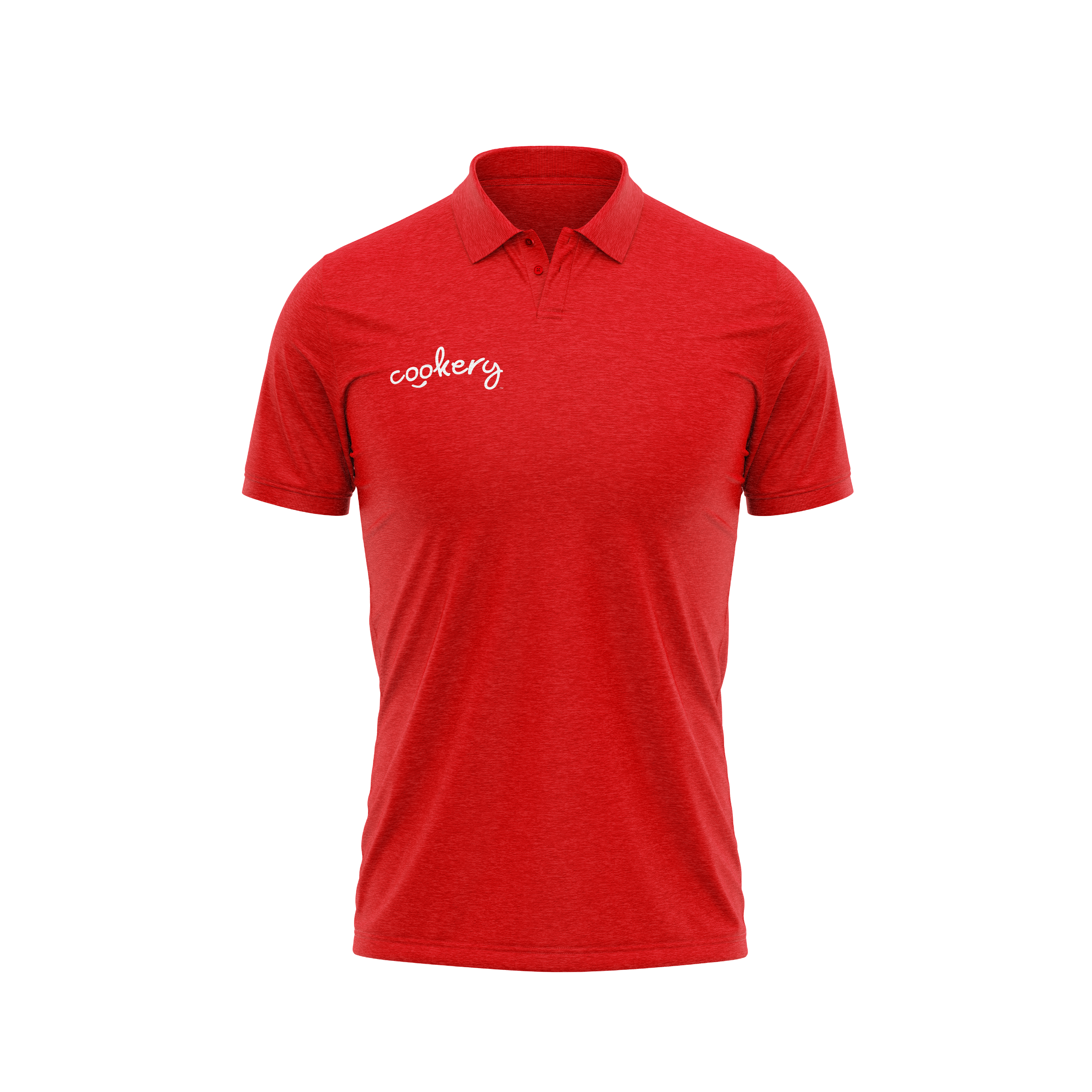
Our brand name serves as the cornerstone of our visual identity, with some added elements to create a balanced and attractive shape.
One of the most notable features of our logo is the smile added to the double O letters in the middle.
This represents a smiling face that licks its lips, expressing the deliciousness of the food that can be cooked using our platform.
The simple design of the logo makes it perfect for use on both mobile devices.
تواصل معنا، نحن هنا لمساعدتك.
تواصل معنا الآن